

Data Insights widgets provide you with fast insights into key performance indicators (KPIs![]() An established metric used to measure agent performance.) and metrics. The widgets use charts, graphs, and tables to depict data. This makes it simpler to grasp trends, patterns, and shifts. You can use the different Data Insights widgets on your dashboard to visualize and interpret data in real-time. This helps you make informed decisions to improve efficiency, customer satisfaction, and performance.
An established metric used to measure agent performance.) and metrics. The widgets use charts, graphs, and tables to depict data. This makes it simpler to grasp trends, patterns, and shifts. You can use the different Data Insights widgets on your dashboard to visualize and interpret data in real-time. This helps you make informed decisions to improve efficiency, customer satisfaction, and performance.
You can drag and drop the widgets or double-click the widget to add them to your dashboard. You can also use the settings to add your filters to see the data.
Organizations with a NiCE CXone Performance Management (Native) license can access up to 95 days of historical data within a 25-month lookback period. Those with a dashboard-only license are limited to same-day data.
You may see differences in values across widgets because each widget calculates metrics differently based on its level of detail. For example, when a contact is associated with multiple skills or multiple agents, it may be counted more than once in some widgets, while other widgets calculate a single parent level total based on the Employee or Contact hierarchy.
Use only metrics that match your licensed and supported products. Metrics from products you do not have a license for may still appear, but their results are not valid.
Metric and Filter Selection
Keep the following in mind when selecting the metrics and filters available in the metric settings.
Near Real-time Metrics
Whenever you select near real-time metrics in the Data Insights widgets, they will always display the current value, irrespective of the duration or interval you apply in the widget settings.
Multiple Domain Metrics Selection
When selecting metrics from different domains in the Data Insights widgets, the data with the shortest available date range is displayed.
If you combine:
Agent Handle Time (ACD metric - limited to 90 days)
Quality Score (QM metric - limited to 13 months)
Your widget will only show 90 days of data, as this is the shorter duration between the two metrics.
Date Range
When you select multiple domain metrics, the Data Insights widgets will display the date range that has a lower date duration. For example, if you select a digital and a real-time metric.
Data Filters
The Data Insights widgets allow you to apply different dimensions, such as Team or Skill and attributes like Media Type and Direction as data filters. With the Metrics Summary and Metrics Interval widget, you can set them to display data based on a specific dimension or attribute. However, not every dimension and attribute is applicable to every metric. The available dimensions and attributes will differ depending on the particular metric you select.
-
The Unavailable Time metric can be applied with the Agent and Team filters, but not with the Skill or Campaign filters.
-
The In Queue metric can be viewed by the Skill and Campaign dimensions, but not by the Agent and Team dimensions.
View By filters in Metric Selection
-
Metrics and View By filters work together to display your data accurately.
-
Each metric has specific compatible View By filters. When you select a metric, you'll only see View By options that work with it. Similarly, when you set a View By filter, only compatible metrics will be available, while others will be grayed out.
-
If you use a View By filter that doesn't match your selected metrics, those metrics will show a value of 0 in the widget.
-
Remember, if you change your metric after setting a View By filter, you might need to update the View By filter to match the options of the new metric. Always double-check your settings when making changes to ensure your data is displayed correctly.
 Example
If you initially select the metric ACW Time with View by Skill, then switch to Available Time, you might need to change the view by filter to either Agent, team or Company as Skill is not a compatible filter option for Available Time.
-
Adjusting filters for grayed out metrics:
If you notice some metrics are grayed out in the metric list, it's likely due to an incompatible view by filter selection. You can access these grayed-out metrics by:
-
Check your current view by filter setting and change the view by filter to an option that is compatible with the desired metric.
-
After a compatible filter is selected, the previously grayed-out metric should become available.
-
-
New dispositions require a processing period of up to 24 hours before appearing in the dashboard. This processing time applies to all Data Insights widgets with the View by Disposition feature. After the initial processing period, new dispositions and their associated data will be automatically integrated into the relevant widgets.
To determine which dimensions and attributes are applicable for each metric, refer to the Metrics List. Additionally, when selecting a metric, you can hover over it to view the relevant dimensions and attributes that can be applied as filters.
-
Visualizing Objectives
This feature is only available for organizations with the PM (CXone) license.
The visualization of objectives feature is only available in the Data Insights widgets. You can set objectives for various metrics via Performance Management (New) > Objectives.
If your objectives match the filters you select in the widget settings, the widget will display color-coded columns. These colors indicate the different performance levels of your objectives for the selected metrics. Even though you set objectives separately, they will automatically display in the widgets once created.
This feature applies to Metrics Summary, Metrics Interval, and KPI widgets. It will also apply to the Gauge, Metrics Review, and Leaderboard widgets, provided you have a PM (CXone) license.
Here’s how it works for each widget:
-
Metrics Summary, Metrics Review and Metrics Interval: Objectives are applied to the Tabular view. The table cells are color-coded based on the set objective for the metric.
-
Gauge: The gauge will be filled with color according to the objective. If no objective is set, the gauge remains uncolored.
-
Leaderboard: The cell color will indicate the objective.
-
KPI: The metric number will have a colored background to represent the objective.
-
KPI Trend: shows a colorful line and the colors represent specific objective ranges. Hovering over the line provides more details. If no objective is set only the trend line is visible
This feature enhances data visualization, making it easier to understand whether the objectives are being achieved.
Gauge
The gauge widget provides you with real-time data on your selected metric and its current progress towards any goals that you set. You can use this widget to understand the performance against the goals you set.
-
Real-time metrics (ACD real-time): 7-10 seconds
-
Other metrics
-
Contact-based metrics: 5 to 10 minutes after the end of the contact.
-
Agent state-based metrics: 5 to 10 minutes after the agent's state ends.
-
Digital Experience (DX) Metrics: 15 Minutes
-
Widget refresh rate
When the widget includes:
-
Real-time metrics: 7 seconds
-
Other metrics: 90 seconds
Widget refresh rates depend on the selected date range:
-
Today without real-time metrics: 1.5 minutes
-
Today with real-time metrics: 7 seconds
-
Yesterday or any date range excluding today: No refresh
-
Date ranges including today (for example, last 7 days, last 30 days): 30 minutes
This widget is only available for organizations with the PM (CXone) license.
You must have these permissions:
-
Dashboard > Data Insights Widgets > Gauge:On
-
Dashboard > Dashboards: View
-
Dashboard > Dashboards: Edit (optional)
If you cannot access the widgets or Dashboard, check with your administrator. The administrator can find these permissions in NiCE CXone. Go to Admin > Security Settings > Roles and Permissions and select the role.
As a viewer, you can modify the display settings of the widget which will be saved as your personal settings. However, if the dashboard owners make changes to the dashboard after you have saved your modifications, their changes will override your personal settings.
Click Options  and then Settings on the widget to filter the data you want to see in each widget.
Field descriptions
-
Display Name: Define a name for the widget.
-
Metrics: You can select from Suite, Real-time, Digital, Voice ACD, Guide, QM, and Coaching metric types, to include on the widget.
Time-based metrics include a format option that allows you to customize how time values are displayed in the widget. You can choose from the following display formats: Seconds, Minutes, Hour, HH:MM:SS and HH:MM:SS:SSS.
-
Date Range: Define the date range. You can set a custom date range or choose from options, like Today, Yesterday, Last 7 days, Last 30 days, Last 90 days, Last Week, Last Month and Custom range.
-
If you set the Time filter to Include or Exclude a specific time period, then you can only select Today, Yesterday, Last 7 days, Last Week, Last Month or Last 30 days.
The date picker is displayed only when you select at least one historical metric. It does not display when you select near real-time metrics.
-
-
Time: Define the time period. You can Include or Exclude a specific time period.
-
Team: Select the teams to include in the widget. Only the agents from the teams you select are displayed. The Current Team filter restricts other team selections and requires a PM license.
-
Agent: Select the agents to include in the widget from your selected teams in the Teams filter. The Current Agent filter restricts other agent selections and requires a PM license. Inactive agents are displayed on the dashboard only if the selected date range includes a period when they were active. If the date range includes a period before and after they've become inactive, they will not be displayed.
-
Campaign: Select the campaign that you want to include in the widget.
-
Skill: Select the agent skills
Used to automate delivery of interactions based on agent skills, abilities, and knowledge. to include in the widget. -
Data Attribute: Select the data attribute that you want to use as a metric filter for the widget. You can choose from options like Agent, Company, Campaign
A grouping of skills used to run reports., Skill Used to automate delivery of interactions based on agent skills, abilities, and knowledge., Team.-
ACD/Voice: Media Type
A medium, such as voice, email, and chat, through which a contact connects with an intended recipient., Disposition Result assigned by the agent or system at the end of a voice (disposition) or digital (status) interaction., Direction The metric direction upwards or downwards. -
Digital: Channel
Various voice and digital communication mediums that facilitate customer interactions in a contact center., Disposition, Tag Name, Direction, Contact Type A type of contact handled in one or more MUs such as emails, chat sessions, or inbound calls. -
Guide: Engagement Type
The type of engagement that could be a link, article entry point, and chat., Engagement Rule, Device The device type in which the user is using the suite. -
Coaching: Coaching Status
The coaching status of the agent., Coaching type The type of coaching assigned to the agent.
-
KPI
The KPI![]() An established metric used to measure agent performance. widget shows you the status of your key performance indicators (metrics) over a specific time or for the current day at a selected time.
An established metric used to measure agent performance. widget shows you the status of your key performance indicators (metrics) over a specific time or for the current day at a selected time.
Data refresh rate
-
Real-time metrics (ACD real-time): 7-10 seconds
-
Other metrics
-
Contact-based metrics: 5 to 10 minutes after the end of the contact
-
Agent state-based metrics: 5 to 10 minutes after the agent's state ends
-
Digital Experience (DX) Metrics: 15 minutes
-
Widget refresh rate
When the widget includes:
-
Real-time metrics: 7 seconds
-
Other metrics: 90 seconds
Widget refresh rates depend on the selected date range:
-
Today without real-time metrics: 1.5 minutes
-
Today with real-time metrics: 7 seconds
-
Yesterday or any date range excluding today: No refresh
-
Date ranges including today (for example, last 7 days, last 30 days): 30 minutes
You must have these permissions:
-
Dashboard > Data Insights Widgets > KPI: On
-
Dashboard > Dashboards: View
-
Dashboard > Dashboards: Edit (optional)
If you cannot access the widgets or Dashboard, check with your administrator. The administrator can find these permissions in NiCE CXone. Go to Admin > Security Settings > Roles and Permissions and select the role.
On Widget Display, you can choose between the Horizontal or Vertical view to display your widget.
As a viewer, you can modify the display settings of the widget which will be saved as your personal settings. However, if the dashboard owners make changes to the dashboard after you have saved your modifications, their changes will override your personal settings.
Click Options and then Settings on the widget to filter the data you want to see in each widget.
Field descriptions
-
Display Name: Define a name for the widget.
-
Hierarchy: For QM metrics, filter the widget's data as per the CXone hierarchy level selected. Data in the widget is limited to the hierarchy you select.
-
Metrics: You can select from Suite, Real-time, Digital, Voice ACD, Guide, QM, and Coaching metric types, to include on the widget.
Time-based metrics include a format option that allows you to customize how time values are displayed in the widget. You can choose from the following display formats: Seconds, Minutes, Hour, HH:MM:SS and HH:MM:SS:SSS.
-
Date Range: Define the date range. You can set a custom date range or choose from options, like Today, Yesterday, Last 7 days, Last 30 days, Last 90 days, Last Week, Last Month and Custom range.
-
If you set the Time filter to Include or Exclude a specific time period, then you can only select Today, Yesterday, Last 7 days, Last Week, Last Month or Last 30 days.
The date picker is displayed only when you select at least one historical metric. It does not display when you select near real-time metrics.
-
-
Days of the Week: Select the days of the week you want to include in the widget, for example, Sunday, Monday or Saturday
This options available are conditionally displayed based on the selected Date Range:
-
Hidden when the Date Range is set to Today or Yesterday.
-
Visible for all other date ranges (for example, Last 30 Days, Custom Ranges).
-
-
Time: Define the time period. You can Include or Exclude a specific time period.
-
Team: Select the teams to include in the widget. Only the agents from the teams you select are displayed. The Current Team filter restricts other team selections and requires a PM license.
-
Agent: Select the agents to include in the widget from your selected teams in the Teams filter. The Current Agent filter restricts other agent selections and requires a PM license. Inactive agents are displayed on the dashboard only if the selected date range includes a period when they were active. If the date range includes a period before and after they've become inactive, they will not be displayed.
-
Campaign: Select the campaign that you want to include in the widget.
-
Skill: Select the agent skills
Used to automate delivery of interactions based on agent skills, abilities, and knowledge. to include in the widget. -
Data Attribute: Select the data attribute that you want to use as a metric filter for the widget. You can choose from options like Agent, Company, Campaign
A grouping of skills used to run reports., Skill Used to automate delivery of interactions based on agent skills, abilities, and knowledge., Team.-
ACD/Voice: Media Type
A medium, such as voice, email, and chat, through which a contact connects with an intended recipient., Disposition Result assigned by the agent or system at the end of a voice (disposition) or digital (status) interaction., Direction The metric direction upwards or downwards. -
Digital: Channel
Various voice and digital communication mediums that facilitate customer interactions in a contact center., Disposition, Tag Name, Direction, Contact Type A type of contact handled in one or more MUs such as emails, chat sessions, or inbound calls. -
Guide: Engagement Type
The type of engagement that could be a link, article entry point, and chat., Engagement Rule, Device The device type in which the user is using the suite. -
Coaching: Coaching Status
The coaching status of the agent., Coaching type The type of coaching assigned to the agent.
-
-
Division ID: Use this filter to view data only for specific divisions in your tenant. This lets you analyze evaluations, coaching, and related metrics at the division level instead of across all divisions.
A supervisor examines the KPIs related to agent performance during peak hours. They can detect problems with individual or team performance and take action to improve it.
KPI Trend
The KPI Trend widget displays the direction or pattern in which a Key Performance Indicator (KPI![]() An established metric used to measure agent performance.) or metric moves over a certain period. You can use this widget to track metrics and analyze trends, which will help you get to know the efficiency of your contact center processes. The widget also displays variance information, highlighting the difference between the current and previous periods. This will help you to quickly identify performance improvements or declines.
An established metric used to measure agent performance.) or metric moves over a certain period. You can use this widget to track metrics and analyze trends, which will help you get to know the efficiency of your contact center processes. The widget also displays variance information, highlighting the difference between the current and previous periods. This will help you to quickly identify performance improvements or declines.
By default, the widget opens in Chart view. Click Options , then Widget Display to change the view to Table, or Table and Chart side by side.
Data refresh rate
-
Real-time metrics (ACD real-time): 7-10 seconds
-
Other metrics
-
Contact-based metrics: 5 to 10 minutes after the end of the contact.
-
Agent state-based metrics: 5 to 10 minutes after the agent's state ends.
-
Digital Experience (DX) Metrics: 15 Minutes
-
Widget refresh rate
When the widget includes:
-
Real-time metrics: 7 seconds
-
Other metrics: 90 seconds
Widget refresh rates depend on the selected date range:
-
Today without real-time metrics: 1.5 minutes
-
Today with real-time metrics: 7 seconds
-
Yesterday or any date range excluding today: No refresh
-
Date ranges including today (for example, last 7 days, last 30 days): 30 minutes
You must have these permissions:
-
Dashboard > Data Insights Widgets > KPI Trend: On
-
Dashboard > Dashboards: View
-
Dashboard > Dashboards: Edit (optional)
If you cannot access the widgets or Dashboard, check with your administrator. The administrator can find these permissions in NiCE CXone. Go to Admin > Security Settings > Roles and Permissions and select the role.
This widget displays a break-down view which is further divided by team, agent, campaign, or skill. When you select one of these options, the widget automatically selects the first five items from the list. For example, if you select Team, the first five teams will be chosen by default.
The widget then displays different trend lines for the same metric based on your selection. For example, if you select Team, it will show the trend lines for each team.
The dropdown menu lists all items, regardless of the first five default selections. For example, if you select Agent, the dropdown lists all agents, not just the first five. This view gives you a broader view of your KPI trends across different categories.
On Widget Display, you can choose between the Compact or Detailed view to display your widget.
The Detailed view includes variance information, showing the difference between the current period's KPI value and the previous one. The Variance is color-coded for clarity:
-
Green: indicates a positive change (improvement).
-
Red: indicates a negative change (decline).
This makes it easier to spot performance trends and supports smarter decisions by comparing data over time.
As a viewer, you can modify the display settings of the widget which will be saved as your personal settings. However, if the dashboard owners make changes to the dashboard after you have saved your modifications, their changes will override your personal settings.
Click Options and then Settings on the widget to filter the data you want to see in each widget.
Field descriptions
-
Display Name: Define a name for the widget.
-
Hierarchy: For QM metrics, filter the widget's data as per the CXone hierarchy level selected. Data in the widget is limited to the hierarchy you select.
-
Metrics: You can select from Suite, Real-time, Digital, Voice ACD, Guide, QM, and Coaching metric types, to include on the widget.
Time-based metrics include a format option that allows you to customize how time values are displayed in the widget. You can choose from the following display formats: Seconds, Minutes, Hour, HH:MM:SS and HH:MM:SS:SSS.
-
View By: Select the filter to view the metrics by. You can choose from options like: Agent, Company, Campaign
A grouping of skills used to run reports., Skill Used to automate delivery of interactions based on agent skills, abilities, and knowledge., Team, Media Type A medium, such as voice, email, and chat, through which a contact connects with an intended recipient., Disposition Result assigned by the agent or system at the end of a voice (disposition) or digital (status) interaction., Direction The metric direction upwards or downwards., Channel Various voice and digital communication mediums that facilitate customer interactions in a contact center., Tag Name, Contact Type A type of contact handled in one or more MUs such as emails, chat sessions, or inbound calls., Engagement Rule, Engagement Type The type of engagement that could be a link, article entry point, and chat., Rule Name, Device The device type in which the user is using the suite., Coaching Status The coaching status of the agent., Coaching type The type of coaching assigned to the agent..When set to View By Team, up to five teams can be selected.
-
The default value selected in the filter is Company.
-
-
Date Range: Define the date range. You can set a custom date range or choose from options, like Today, Yesterday, Last 7 days, Last 30 days, Last 90 days, Last Week, Last Month and Custom range.
-
If you set the Time filter to Include or Exclude a specific time period, then you can only select Today, Yesterday, Last 7 days, Last Week, Last Month or Last 30 days.
The date picker is displayed only when you select at least one historical metric. It does not display when you select near real-time metrics.
-
-
Time: Define the time period. You can Include or Exclude a specific time period.
-
Interval Unit: Define the interval time range. You can set the interval time from options, like 15 minutes, 30 minutes, and Hour.
-
Team: Select the teams to include in the widget. Only the agents from the teams you select are displayed. The Current Team filter restricts other team selections and requires a PM license.
-
Agent: Select the agents to include in the widget from the teams you have selected in the Teams filter. The Current Agent filter restricts other agent selections and requires a PM license. Inactive agents are displayed on the dashboard only if the selected date range includes a period when they were active. If the date range includes a period before and after they've become inactive, they will not be displayed.
-
Campaign: Select the campaign that you want to include in the widget.
-
Skill: Select the agent skills
Used to automate delivery of interactions based on agent skills, abilities, and knowledge. to include in the widget. -
Data Attribute: Select the data attribute that you want to use as a metric filter for the widget. You can choose from options like: Agent, Company, Campaign
A grouping of skills used to run reports., Skill Used to automate delivery of interactions based on agent skills, abilities, and knowledge., Team.-
ACD/Voice: Media Type
A medium, such as voice, email, and chat, through which a contact connects with an intended recipient., Disposition Result assigned by the agent or system at the end of a voice (disposition) or digital (status) interaction., Direction The metric direction upwards or downwards. -
Digital: Channel
Various voice and digital communication mediums that facilitate customer interactions in a contact center., Disposition, Tag Name, Direction, Contact Type A type of contact handled in one or more MUs such as emails, chat sessions, or inbound calls. -
Guide: Engagement Type
The type of engagement that could be a link, article entry point, and chat., Engagement Rule, Device The device type in which the user is using the suite. -
Coaching: Coaching Status
The coaching status of the agent., Coaching type The type of coaching assigned to the agent.
-
-
Division ID: Use this filter to view data only for specific divisions in your tenant. This lets you analyze evaluations, coaching, and related metrics at the division level instead of across all divisions.
Leaderboard
The Leaderboard widget displays the ranking of agents in your team based on the metric you select. It provides visibility over their performance and the team’s performance. As an agent or supervisor, you can use this widget to track your team’s performance and identify areas for improvement.
It highlights the current user's row, highlighting the current ranking within the team. Additionally, My Ranking is displayed at the top of the widget for easy reference
Data refresh rate
-
Real-time metrics ( real-time): 7-10 seconds
-
Other metrics
-
Contact-based metrics: 5 to 10 minutes after the end of the contact.
-
Agent state-based metrics: 5 to 10 minutes after the agent's state ends.
-
Digital Experience (DX) Metrics: 15 Minutes
-
Widget refresh rate
When the widget includes:
-
Real-time metrics: 7 seconds
-
Other metrics: 90 seconds
Widget refresh rates depend on the selected date range:
-
Today without real-time metrics: 1.5 minutes
-
Today with real-time metrics: 7 seconds
-
Yesterday or any date range excluding today: No refresh
-
Date ranges including today (for example, last 7 days, last 30 days): 30 minutes
This widget is only available for organizations with the PM (CXone) license.
You must have these permissions:
-
Dashboard > Data Insights Widgets > Leaderboard: On
-
Dashboard > Dashboards: View
-
Dashboard > Dashboards: Edit (optional)
If you cannot access the widgets or Dashboard, check with your administrator. The administrator can find these permissions in NiCE CXone. Go to Admin > Security Settings > Roles and Permissions and select the role.
Click Options next to the agent's name to open the Metrics Interval widget, view Agent State Details or Give Award.
You need to have the Agent Zoom permission enabled in Dashboard to view the agent state details.
Click Options next to the agent to view the summary of the different states of a specific agent.
You can then select Agent State Details which displays the agent's State in different colors, the Start Time, Duration, and Skill. This helps you to zoom into the agent's state details.
-
The Summary in the Agent State Details displays an agent’s state distribution. It includes a bar chart and percentages for different states. Each category is color-coded and shows the percentage of time and the exact duration (in hours, minutes, and seconds) the agent spent in each state.
| Color | State |
|---|---|

|
Number of agents in the Available state and prepared to handle contacts. |

|
Number of agents in the Working Contacts & Dialer state. This includes agents actively handling a contact and also agents in an ACW |

|
Number of agents in a Logged Out state. |

|
Number of agents in an Unavailable state. |

|
Number of agents in the Available & Dialer state. |

|
Number of agents in the Working Contacts state. This includes agents actively handling a contact and also agents in an ACW |
-
The Agent Zoom feature supports historical data up to 14 days.
-
The refresh rate for agent zoom is within 5 to 10 minutes after the agent's state ends.
Managers or supervisors can use the Give Award feature to recognize and reward employees by giving them performance-based incentives or awards in the form of coins.
This feature is only available for organizations with the PM license and the Gamification > Give Award permission enabled.
The Give Award feature allows managers or supervisors to recognize and reward employees by giving them performance-based incentives or awards in the form of coins.
To use Give Award:
-
Click Options
next to the agent's name and then click Give Award. -
The Give Award window displays the name of the selected agent receiving the award at the top. You can also search for specific awards by name.
-
The available awards are displayed in a card-based layout, organized into folders. Each award card shows the award's name, a badge or icon, and the number of coins associated with that award.
-
The awards shown in the dialog box are based on your Give Award permission level and the selected receiving agent's team assignments.
-
If you have the Give Award permission, it will include all awards assigned to the selected agent or their team.
-
When you select an award to give, the coins are deducted from the budget and added to the receiving agent's balance when the award is given.
-
When an agent receives an award, they are informed through notification and an email, of the award they received.
Click Launch Coaching to initiate a coaching session directly from the dashboard. The launched session opens in a new tab with details like the agent’s name and metric name. The metric name is displayed only when the coaching session is in the Draft status. You need to have the Coaching permissions to use this feature.
Click Options and then Settings on the widget to filter the data you want to see in each widget.
Field descriptions
-
Display Name: Define a name for the widget.
-
Metrics: You can select from Suite, Real-time, Digital, Voice ACD, Guide, QM, and Coaching metric types, to include on the widget.
Time-based metrics include a format option that allows you to customize how time values are displayed in the widget. You can choose from the following display formats: Seconds, Minutes, Hour, HH:MM:SS and HH:MM:SS:SSS.
-
Date Range: Define the date range. You can set a custom date range or choose from options, like Today, Yesterday, Last 7 days, Last 30 days, Last 90 days, Last Week, Last Month and Custom range.
-
If you set the Time filter to Include or Exclude a specific time period, then you can only select Today, Yesterday, Last 7 days, Last Week, Last Month or Last 30 days.
The date picker is displayed only when you select at least one historical metric. It does not display when you select near real-time metrics.
-
-
Days of the Week: Select the days of the week you want to include in the widget, for example, Sunday, Monday or Saturday
-
Hidden when the Date Range is set to Today or Yesterday.
-
Visible for all other date ranges (for example, Last 30 Days, Custom Ranges).
-
Time: Define the time period. You can Include or Exclude a specific time period.
-
Team: Select the teams to include in the widget. Only the agents from the teams you select are displayed. The Current Team filter restricts other team selections and requires a PM license.
-
Agent: Select the agents to include in the widget from your selected teams in the Teams filter. The Current Agent filter restricts other agent selections and requires a PM license. Inactive agents are displayed on the dashboard only if the selected date range includes a period when they were active. If the date range includes a period before and after they've become inactive, they will not be displayed.
-
Campaign: Select the campaign that you want to include in the widget.
-
Skill: Select the agent skills
Used to automate delivery of interactions based on agent skills, abilities, and knowledge. to include in the widget. -
Data Attribute: Select the data attribute that you want to use as a metric filter for the widget. You can choose from options like Agent, Company, Campaign
A grouping of skills used to run reports., Skill Used to automate delivery of interactions based on agent skills, abilities, and knowledge., Team.-
ACD/Voice: Media Type
A medium, such as voice, email, and chat, through which a contact connects with an intended recipient., Disposition Result assigned by the agent or system at the end of a voice (disposition) or digital (status) interaction., Direction The metric direction upwards or downwards. -
Digital Experience (DX): Channel
Various voice and digital communication mediums that facilitate customer interactions in a contact center., Disposition, Tag Name, Direction, Contact Type A type of contact handled in one or more MUs such as emails, chat sessions, or inbound calls. -
Guide: Engagement Type
The type of engagement that could be a link, article entry point, and chat., Engagement Rule, Device The device type in which the user is using the suite. -
Coaching: Coaching Status
The coaching status of the agent., Coaching type The type of coaching assigned to the agent.
-
-
Metrics: You can select from Suite, Real-time, Digital, Voice ACD, Guide, QM, and Coaching metric types, to include on the widget. click here.
This options available are conditionally displayed based on the selected Date Range:
Metric Breakdown
The Metric Breakdown widget displays an aggregated view of count and non-percentage metric values for various entities based on the entity type you select in the View By setting.
On Widget Display, you can display the data in your widget as a Table, Chart, or Table and Chart. In addition to that you can select the position of the chart legend In Legend Position.
On Chart Display, you have the option to present the data using Legends or Data Labels. The data label will not be displayed on the chart for values less than two percent.
Data refresh rate
-
Real-time metrics (ACD real-time): 7-10 seconds
-
Other metrics
-
Contact-based metrics: 5 to 10 minutes after the end of the contact
-
Agent state-based metrics: 5 to 10 minutes after agent's state ends
-
Digital Experience (DX) Metrics: 15 minutes
-
Widget refresh rate
When the widget includes:
-
Real-time metrics: 7 seconds
-
Other metrics: 90 seconds
Widget refresh rates depend on the selected date range:
-
Today without real-time metrics: 1.5 minutes
-
Today with real-time metrics: 7 seconds
-
Yesterday or any date range excluding today: No refresh
-
Date ranges including today (for example, last 7 days, last 30 days): 30 minutes
You must have these permissions:
-
Dashboard > Data Insights Widgets >Metric Breakdown: On
-
Dashboard > Dashboards: View
-
Dashboard > Dashboards: Edit (optional)
If you cannot access the widgets or Dashboard, check with your administrator. The administrator can find these permissions in NiCE CXone. Go to Admin > Security Settings > Roles and Permissions and select the role.
As a viewer, you can modify the display settings of the widget which will be saved as your personal settings. However, if the dashboard owners make changes to the dashboard after you have saved your modifications, their changes will override your personal settings.
Click Options and then Settings on the widget to filter the data you want to see in each widget.
Field descriptions
-
Display Name: Define a name for the widget.
-
Hierarchy: For QM metrics, filter the widget's data as per the CXone hierarchy level selected. Data in the widget is limited to the hierarchy you select.
-
Metrics: You can select from Suite, Real-time, Digital, Voice ACD, Guide, QM, and Coaching metric types, to include on the widget.
To ensure accurate data visualization, the Metric Breakdown Widget disables certain metrics that may contain negative values. These metrics cannot be represented correctly in pie charts and are, therefore, grayed out and cannot be selected.
Disabled Metrics Include: Agt First Resp Rate, Avg Active Time, Avg ACW Time, Avg Agent FRT, Avg Agent Responses, Avg Customer Resp, Avg FollOn Resp Time, Avg Handle Time, Avg Hold Count, Avg Hold Time, Max Abandon Time, Max ACW Time, Max Hold Time.
Time-based metrics include a format option that allows you to customize how time values are displayed in the widget. You can choose from the following display formats: Seconds, Minutes, Hour, HH:MM:SS and HH:MM:SS:SSS.
-
View By: Select the filter to view the metrics by. You can choose from options like: Agent, Company, Campaign
A grouping of skills used to run reports., Skill Used to automate delivery of interactions based on agent skills, abilities, and knowledge., Team, Media Type A medium, such as voice, email, and chat, through which a contact connects with an intended recipient., Disposition Result assigned by the agent or system at the end of a voice (disposition) or digital (status) interaction., Direction The metric direction upwards or downwards., Channel Various voice and digital communication mediums that facilitate customer interactions in a contact center., Tag Name, Contact Type A type of contact handled in one or more MUs such as emails, chat sessions, or inbound calls., Engagement Rule, Engagement Type The type of engagement that could be a link, article entry point, and chat., Rule Name, Device The device type in which the user is using the suite., Coaching Status The coaching status of the agent., Coaching type The type of coaching assigned to the agent..-
In the View By filter when you select Agent, the widget will display the details for each agent. Click Options
next to the Agent's name to view Agent State Details.
-
-
Date Range: Define the date range. You can set a custom date range or choose from options, like Today, Yesterday, Last 7 days, Last 30 days, Last 90 days, Last Week, Last Month and Custom range.
-
If you set the Time filter to Include or Exclude a specific time period, then you can only select Today, Yesterday, Last 7 days, Last Week, Last Month or Last 30 days.
The date picker is displayed only when you select at least one historical metric. It does not display when you select near real-time metrics.
-
-
Time: Define the time period. You can Include or Exclude a specific time period.
-
Team: Select the teams to include in the widget. Only the agents from the teams you select are displayed. The Current Team filter restricts other team selections and requires a PM license.
-
Agent: Select the agents to include in the widget from your selected teams in the Teams filter. The Current Agent filter restricts other agent selections and requires a PM license. Inactive agents are displayed on the dashboard only if the selected date range includes a period when they were active. If the date range includes a period before and after they've become inactive, they will not be displayed.
-
Campaign: Select the campaign that you want to include in the widget.
-
Skill: Select the agent skills
Used to automate delivery of interactions based on agent skills, abilities, and knowledge. to include in the widget. -
Data Attribute: Select the data attribute that you want to use as a metric filter for the widget. You can choose from options like Agent, Company, Campaign
A grouping of skills used to run reports., Skill Used to automate delivery of interactions based on agent skills, abilities, and knowledge., Team.-
ACD/Voice: Media Type
A medium, such as voice, email, and chat, through which a contact connects with an intended recipient., Disposition Result assigned by the agent or system at the end of a voice (disposition) or digital (status) interaction., Direction The metric direction upwards or downwards. -
Digital Experience (DX): Channel
Various voice and digital communication mediums that facilitate customer interactions in a contact center., Disposition, Tag Name, Direction, Contact Type A type of contact handled in one or more MUs such as emails, chat sessions, or inbound calls. -
Guide: Engagement Type
The type of engagement that could be a link, article entry point, and chat., Engagement Rule, CTA Name Call to Actions, Device The device type in which the user is using the suite. -
Coaching: Coaching type
The type of coaching assigned to the agent. , Coaching Status The coaching status of the agent.
-
-
Division ID: Use this filter to view data only for specific divisions in your tenant. This lets you analyze evaluations, coaching, and related metrics at the division level instead of across all divisions.
You can customize the columns:
-
Click
 to auto size a specific column or all the columns.
 -
Click
 to select filter options.
 -
Click
 to select the columns you want to see on the widget.
You can personalize your column settings by adjusting the column size, sort, filter, and arrangement, and then save these changes, even with the View dashboard permission.
Sorting table columns
You can sort the data in the table by clicking a column header. To apply a secondary sort, hold down the Shift key and click another column header.
-
The primary sort column displays a 1 next to the column title.
-
The secondary sort column displays a 2 next to the column title.
-
A team leader wants to compare active talk time across different teams to assess overall team performance. They use the Metric Breakdown widget, select Avg Handle Time, and select the Team view on the widget. The widget shows Active Talk Time aggregated by each team. This allows the team leader to identify high-performing teams and address performance gaps.
-
A team leader needs to analyze his agents' performance and see how quickly their team handles customer calls. He uses the Metric Breakdown widget, selects Call Handling Time, and sees how long each team member takes on a call. This helps him determine who's doing well and who needs more training to speed up. Using this tool, the team leader can improve his team's speed.
Metric Comparison Widget
For Dashboard users, this Data Insights widget is available only for prebuilt reports on the Reports page.
Data refresh rate
-
Historical metrics will refresh every 15 – 30 minutes
Widget refresh rate
-
When the widget includes other metrics:
-
You will see updates every 90 seconds
-
Widget refresh rates depend on the selected date range:
• Other metrics: 90 seconds
-
Widget refresh rates depend on the selected date range:
-
Today without real-time metrics: 1.5 minutes
-
Yesterday or any date range excluding today: No refresh
-
Date range 1 including today (for example, last 7 days, last 30 days): 30 minutes
-
Date range 2 including today (for example, last 7 days, last 30 days): 30 minutes
-
Duration Support
Historical: 25 months of data in a rolling widow of 95 days
You must have these permissions:
-
Dashboard > Data Insights Widgets >Metric Comparison: On
-
Dashboard > Dashboards:View
-
Dashboard > Dashboards: Edit (optional)
If you cannot access the widgets or Dashboard, check with your administrator. The administrator can find these permissions in NiCE CXone. Go to Admin > Security Settings > Roles and Permissions and select the role.
Field descriptions
-
Display Name: Define a name for the widget.
-
Metrics: You can select from Suite, Digital, Voice ACD, Guide, QM, and Coaching metric types, to include on the widget.
Time-based metrics include a format option that allows you to customize how time values are displayed in the widget. You can choose from the following display formats: Seconds, Minutes, Hour, HH:MM:SS and HH:MM:SS:SSS.
-
Division ID: Use this filter to view data only for specific divisions in your tenant. This lets you analyze evaluations, coaching, and related metrics at the division level instead of across all divisions.
-
View By: Select the filter to view the metrics by. You can choose from options like: Agent, Company, Campaign
A grouping of skills used to run reports., Skill Used to automate delivery of interactions based on agent skills, abilities, and knowledge., Team, Disposition Result assigned by the agent or system at the end of a voice (disposition) or digital (status) interaction., Direction The metric direction upwards or downwards., Channel Various voice and digital communication mediums that facilitate customer interactions in a contact center., Tag Name, Engagement Rule, Engagement Type The type of engagement that could be a link, article entry point, and chat., Rule Name, Device The device type in which the user is using the suite., Coaching Status The coaching status of the agent., CTA Name, Coaching type The type of coaching assigned to the agent..-
In the View By filter when you select Agent, the widget will display Options
next to the Agent's name to view Agent State Details and Give Award.
-
-
Date Range 1: Define the date range. You can set a custom date range or choose from options, like Today, Yesterday, Last 7 days, Last 30 days, Last 90 days, Last Week, Last Month and Custom range.
Date Range 2: Define the date range. You can set a custom date range or choose from options, like Today, Yesterday, Last 7 days, Last 30 days, Last 90 days, Last Week, Last Month and Custom range.
-
If you set the Time filter to Include or Exclude a specific time period, then you can only select Today, Yesterday, Last 7 days, Last Week, Last Month or Last 30 days.
The date picker is displayed only when you select at least one historical metric. It does not display when you select near real-time metrics.
-
-
Time: Define the time period. You can Include or Exclude a specific time period.
-
Team: Select the teams to include in the widget. Only the agents from the teams you select are displayed. The Current Team filter restricts other team selections and requires a PM license.
-
Agent: Select the agents to include in the widget from your selected teams in the Teams filter. The Current Agent filter restricts other agent selections and requires a PM license. Inactive agents are displayed on the dashboard only if the selected date range includes a period when they were active. If the date range includes a period before and after they've become inactive, they will not be displayed.
-
Campaign: Select the campaign that you want to include in the widget.
-
Skill: Select the agent skills
Used to automate delivery of interactions based on agent skills, abilities, and knowledge. to include in the widget. -
Data Attribute: Select the data attribute that you want to use as a metric filter for the widget. You can choose from options like Agent, Company, Campaign
A grouping of skills used to run reports., Skill Used to automate delivery of interactions based on agent skills, abilities, and knowledge., Team.-
ACD/Voice: Disposition
Result assigned by the agent or system at the end of a voice (disposition) or digital (status) interaction., Direction The metric direction upwards or downwards. -
Digital Experience (DX): Channel
Various voice and digital communication mediums that facilitate customer interactions in a contact center., Disposition, Tag Name, Direction -
Guide: Engagement Type
The type of engagement that could be a link, article entry point, and chat., Engagement Rule, CTA Name Call to Actions, Device The device type in which the user is using the suite. -
Coaching: Coaching type
The type of coaching assigned to the agent. , Coaching Status The coaching status of the agent.
-
You can customize the columns:
-
Click
to auto-size a specific column or all the columns. -
Click
to select filter options. -
Click
to select the columns you want to see on the widget.
You can personalize your column settings by adjusting the column size, sort, filter, and arrangement, and then save these changes, even with the View dashboard permission.
Sorting table columns
You can sort the data in the table by clicking a column header. To apply a secondary sort, hold down the Shift key and click another column header. The primary sort column displays a 1 next to the column title.
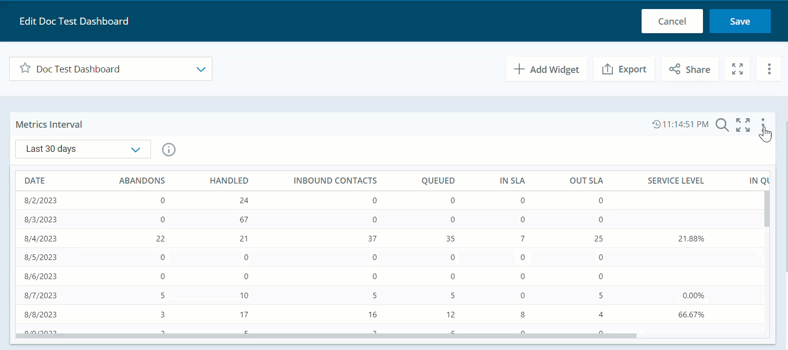
Metrics Interval
This widget shows the value of the metrics![]() Statistics you can measure to keep track of your contact center. aggregated based on time intervals configured in the widget settings. The View By setting controls how the metrics are displayed on the widget.
Statistics you can measure to keep track of your contact center. aggregated based on time intervals configured in the widget settings. The View By setting controls how the metrics are displayed on the widget.
On Thresholds, you can select metrics and use the slider to:
-
Set minimum and maximum values for each range.
-
Configure up to five threshold levels for each metric.
These thresholds define when metrics perform well or need attention. You can monitor performance and identify when metrics meet or exceed the desired thresholds. If you use objectives and have objectives defined for the same metrics for which you create thresholds, the defined thresholds are displayed instead of the objectives.
As a viewer, you can modify the display settings of the widget, table display and threshold, which will be saved as your personal settings. However, if the dashboard owners make changes to the dashboard after you have saved your modifications, their changes will override your personal settings.
On Widget Display, you can display the data in your widget as a Table, Chart, or Table and Chart.
-
In the Chart view, you have the option to choose between Line, Vertical Bar, or Horizontal Bar charts.
-
You also have the flexibility to switch between vertical and horizontal display in bar charts depending on how you want to see your data.
-
The charts will automatically adjust to reflect the sorted order of the table on the widgets. The sorting is linked, ensuring that any changes you make in the table are reflected in the chart. This happens even if you’re switching between grid and chart views or using both together.
A supervisor at a customer service center wants to monitor the performance of teams based on the number of Inbound Contacts they handle for a specific period. They set specific threshold ranges for the Inbound Contacts metric for a month, to identify when a team needs attention or improvement.
-
Green: 70 and upwards
-
Yellow: Between 30 to 60
-
Red: 20 and below.
For example, Team A handles 17 Inbound Contacts, resulting in a red alert on the widget. This signals the supervisor to monitor Team A's performance. Similarly, Team B handles 40 Inbound Contacts, leading to a yellow alert, indicating that the team needs improvement. By setting the threshold limits in the widget, the supervisor can swiftly detect performance issues among teams and take suitable actions.
Click Launch Coaching to initiate a coaching session directly from the dashboard. The launched session opens in a new tab with details like the agent’s name and metric name. The metric name is displayed only when the coaching session is in the Draft status. However, you need to have the Coaching permissions to use this feature.
Data refresh rate
-
Real-time metrics (ACD real-time): 7-10 seconds
-
Other metrics
-
Contact-based metrics: 5 to 10 minutes after the end of the contact
-
Agent state-based metrics: 5 to 10 minutes after agent's state ends
-
Digital Experience (DX) Metrics: 15 minutes
-
Widget refresh rate
When the widget includes:
-
Real-time metrics: 7 seconds
-
Other metrics: 90 seconds
Widget refresh rates depend on the selected date range:
-
Today without real-time metrics: 1.5 minutes
-
Today with real-time metrics: 7 seconds
-
Yesterday or any date range excluding today: No refresh
-
Date ranges including today (for example, last 7 days, last 30 days): 30 minutes
You must have these permissions:
-
Dashboard > Data Insights Widgets >Metrics Interval: On
-
Dashboard > Dashboards:View
-
Dashboard > Dashboards: Edit (optional)
If you cannot access the widgets or Dashboard, check with your administrator. The administrator can find these permissions in NiCE CXone. Go to Admin > Security Settings > Roles and Permissions and select the role.
The Metrics Summary and Metrics Interval widgets are visible to users with the Skill Summary widget permissions. It's better to use the Metrics Summary and Metrics Interval widget permissions. If users have the Skill Summary permission, we recommend switching it to Metrics Summary or Metrics Interval permission as needed.
Click Options and then Settings on the widget to filter the data you want to see in each widget.
Field descriptions
-
Display Name: Define a name for the widget.
-
Hierarchy: For QM metrics, filter the widget's data as per the CXone hierarchy level selected. Data in the widget is limited to the hierarchy you select.
-
Metrics: You can select from Suite, Real-time, Digital, Voice ACD, Guide, QM, and Coaching metric types, to include on the widget.
Time-based metrics include a format option that allows you to customize how time values are displayed in the widget. You can choose from the following display formats: Seconds, Minutes, Hour, HH:MM:SS and HH:MM:SS:SSS.
-
Division ID: Use this filter to view data only for specific divisions in your tenant. This lets you analyze evaluations, coaching, and related metrics at the division level instead of across all divisions.
-
View By: Select the filter to view the metrics by. You can choose from options like: Agent, Company, Campaign
A grouping of skills used to run reports., Skill Used to automate delivery of interactions based on agent skills, abilities, and knowledge., Team, Media Type A medium, such as voice, email, and chat, through which a contact connects with an intended recipient., Disposition Result assigned by the agent or system at the end of a voice (disposition) or digital (status) interaction., Direction The metric direction upwards or downwards., Channel Various voice and digital communication mediums that facilitate customer interactions in a contact center., Tag Name, Contact Type A type of contact handled in one or more MUs such as emails, chat sessions, or inbound calls., Engagement Rule, Engagement Type The type of engagement that could be a link, article entry point, and chat., Rule Name, Device The device type in which the user is using the suite., Coaching Status The coaching status of the agent., CTA Name Call to Actions, and Coaching type The type of coaching assigned to the agent..-
In the View By filter when you select Agent, You can click Options
next to the Agent's name in table view to view Agent State Details and Give Award. -
The Summary in the Agent State Details displays an agent’s state distribution. It includes a bar chart and percentages for different states. Each category is color-coded and shows the percentage of time and the exact duration (in hours, minutes, and seconds) the agent spent in each state.
-
The Agent Zoom feature supports historical data up to 14 days.
-
The refresh rate for agent zoom is within 5 to 10 minutes after the agent's state ends.
-
Click Options
next to the agent's name and then click Give Award. -
The Give Award window displays the name of the selected agent receiving the award at the top. You can also search for specific awards by name.
-
The available awards are displayed in a card-based layout, organized into folders. Each award card shows the award's name, a badge or icon, and the number of coins associated with that award.
-
The awards shown in the dialog box are based on your Give Award permission level and the selected receiving agent's team assignments.
-
If you have the Give Award permission, it will include all awards assigned to the selected agent or their team.
-
When you select an award to give, the coins are deducted from the budget and added to the receiving agent's balance when the award is given.
-
When an agent receives an award, they are informed through notification and an email, of the award they received.
Agent State Details
You need to have the Agent Zoom permission enabled in Dashboard to view the agent state details.
Click Options
next to the agent to view the summary of the different states of a specific agent.You can then select Agent State Details which displays the agent's State in different colors, the Start Time, Duration, and Skill. This helps you to zoom into the agent's state details.
Agent's state colors
Color State
Number of agents in the Available state and prepared to handle contacts.
Number of agents in the Working Contacts & Dialer state. This includes agents actively handling a contact and also agents in an ACW State that allows an agent to complete work requirements after finishing an interaction. state.
Number of agents in a Logged Out state.
Number of agents in an Unavailable state.
Number of agents in the Available & Dialer state.
Number of agents in the Working Contacts state. This includes agents actively handling a contact and also agents in an ACW State that allows an agent to complete work requirements after finishing an interaction. state.Give Award
This feature is only available for organizations with the PM license and the Gamification > Give Award permission enabled.
The Give Award feature allows managers or supervisors to recognize and reward employees by giving them performance-based incentives or awards in the form of coins.
To use Give Award:
-
-
Date Range: Define the date range. You can set a custom date range or choose from options, like Today, Yesterday, Last 7 days, Last 30 days, Last 90 days, Last Week, Last Month and Custom range.
-
If you set the Time filter to Include or Exclude a specific time period, then you can only select Today, Yesterday, Last 7 days, Last Week, Last Month or Last 30 days.
The date picker is displayed only when you select at least one historical metric. It does not display when you select near real-time metrics.
-
-
Time: Define the time period. You can Include or Exclude a specific time period.
-
Interval Unit: Define the interval time range. You can set the interval time from options such as15 minutes, 30 minutes, Hourly, Daily, Weekly and Monthly. Options vary depending on the Date Range you select. If you select Hourly, Daily, Weekly, or Monthly, you can choose intervals such as 1 hour, 1 day, 1 week, or 1 month using the Every option.
-
Include Breakdown (Table View): Select this option to see the metrics based on each time interval as well as drill-down into the metric selected in the column header.
-
-
Team: Select the teams to include in the widget. Only the agents from the teams you select are displayed. The Current Team filter restricts other team selections and requires a PM license.
-
Agent: Select the agents to include in the widget from your selected teams in the Teams filter. The Current Agent filter restricts other agent selections and requires a PM license. Inactive agents are displayed on the dashboard only if the selected date range includes a period when they were active. If the date range includes a period before and after they've become inactive, they will not be displayed.
-
Campaign: Select the campaign that you want to include in the widget.
-
Skill: Select the agent skills
Used to automate delivery of interactions based on agent skills, abilities, and knowledge. to include in the widget. -
Data Attribute: Select the data attribute that you want to use as a metric filter for the widget. You can choose from options like: Agent, Company, Campaign
A grouping of skills used to run reports., Skill Used to automate delivery of interactions based on agent skills, abilities, and knowledge., Team.-
ACD/Voice: Media Type
A medium, such as voice, email, and chat, through which a contact connects with an intended recipient., Disposition Result assigned by the agent or system at the end of a voice (disposition) or digital (status) interaction., Direction The metric direction upwards or downwards. -
Digital Experience (DX): Channel
Various voice and digital communication mediums that facilitate customer interactions in a contact center., Disposition, Tag Name, Direction, Contact Type A type of contact handled in one or more MUs such as emails, chat sessions, or inbound calls. -
Guide: Engagement Type
The type of engagement that could be a link, article entry point, and chat., Engagement Rule, CTA Name Call to Actions, Device The device type in which the user is using the suite. -
Coaching: Coaching Status
The coaching status of the agent., Coaching type The type of coaching assigned to the agent.
-
You can customize the columns:
-
Click
to auto size a specific column or all the columns. -
Click
to select filter options. -
Click
to select the columns you want to see on the widget.
You can personalize your column settings by adjusting the column size, sort, filter, and arrangement, and then save these changes, even with the View dashboard permission.
Sorting table columns
You can sort the data in the table by clicking a column header. To apply a secondary sort, hold down the Shift key and click another column header.
-
The primary sort column displays a 1 next to the column title.
-
The secondary sort column displays a 2 next to the column title.
Metrics Review
The Metrics Review widget allows you to quickly view and compare metric averages for specific time periods like Today, Last 7 days, and Last 30 days. It can be used my managers, supervisors and agents. Managers can use the widget to track the performance of their team as a whole, while supervisors can use it to monitor the performance of individual agents on their team. Agents can also use the widget to monitor their own performance over time.
Data refresh rate
-
Real-time metrics (ACD real-time): 7-10 seconds
-
Other metrics
-
Contact-based metrics: 5 to 10 minutes after the end of the contact
-
Agent state-based metrics: 5 to 10 minutes after agent's state ends
-
Digital Experience (DX) Metrics: 15 minutes
-
Widget refresh rate
When the widget includes:
-
Real-time metrics: 7 seconds
-
Other metrics: 90 seconds
Widget refresh rates depend on the selected date range:
-
Today without real-time metrics: 1.5 minutes
-
Today with real-time metrics: 7 seconds
-
Yesterday or any date range excluding today: No refresh
-
Date ranges including today (for example, last 7 days, last 30 days): 30 minutes
This widget is only available for organizations with the PM (CXone) license.
You must have these permissions:
-
Dashboard > Data Insights Widgets > Metrics Review: On
-
Dashboard > Dashboards: View
-
Dashboard > Dashboards: Edit (optional)
If you cannot access the widgets or Dashboard, check with your administrator. The administrator can find these permissions in NiCE CXone. Go to Admin > Security Settings > Roles and Permissions and select the role.
Click Options and then Settings on the widget to filter the data you want to see in each widget.
Field descriptions
-
Display Name: Define a name for the widget.
-
Metrics: You can select from Suite, Real-time, Digital, Voice ACD, Guide, QM, and Coaching metric types, to include on the widget.
Time-based metrics include a format option that allows you to customize how time values are displayed in the widget. You can choose from the following display formats: Seconds, Minutes, Hour, HH:MM:SS and HH:MM:SS:SSS.
-
Team: Select the teams to include in the widget. Only the agents from the teams you select are displayed. The Current Team filter restricts other team selections and requires a PM license.
-
Agent: Select the agents to include in the widget from your selected teams in the Teams filter. The Current Agent filter restricts other agent selections and requires a PM license. Inactive agents are displayed on the dashboard only if the selected date range includes a period when they were active. If the date range includes a period before and after they've become inactive, they will not be displayed.
-
Campaign: Select the campaign that you want to include in the widget.
-
Skill: Select the agent skills
Used to automate delivery of interactions based on agent skills, abilities, and knowledge. to include in the widget. -
Data Attribute: Select the data attribute that you want to use as a metric filter for the widget. You can choose from options like Agent, Company, Campaign
A grouping of skills used to run reports., Skill Used to automate delivery of interactions based on agent skills, abilities, and knowledge., Team.-
ACD/Voice: Media Type
A medium, such as voice, email, and chat, through which a contact connects with an intended recipient., Disposition Result assigned by the agent or system at the end of a voice (disposition) or digital (status) interaction., Direction The metric direction upwards or downwards. -
Digital Experience (DX): Channel
Various voice and digital communication mediums that facilitate customer interactions in a contact center., Disposition, Tag Name, Direction, Contact Type A type of contact handled in one or more MUs such as emails, chat sessions, or inbound calls. -
Guide: Engagement Type
The type of engagement that could be a link, article entry point, and chat., Engagement Rule, Device The device type in which the user is using the suite. -
Coaching: Coaching Status
The coaching status of the agent., Coaching type The type of coaching assigned to the agent.
-
You can customize the columns:
-
Click
to auto size a specific column or all the columns. -
Click
to select filter options. -
Click
to select the columns you want to see on the widget.
You can personalize your column settings by adjusting the column size, sort, filter, and arrangement, and then save these changes, even with the View dashboard permission.
Sorting table columns
You can sort the data in the table by clicking a column header. To apply a secondary sort, hold down the Shift key and click another column header.
-
The primary sort column displays a 1 next to the column title.
-
The secondary sort column displays a 2 next to the column title.
Metrics Summary
The Metrics Summary widget shows the metrics![]() Statistics you can measure to keep track of your contact center. value aggregated for the option you select in the View By setting. You can drill down to see the metrics based on the hierarchy.
Statistics you can measure to keep track of your contact center. value aggregated for the option you select in the View By setting. You can drill down to see the metrics based on the hierarchy.
On Thresholds, you can select metrics and use the slider to:
-
Set minimum and maximum values for each range.
-
Configure up to five threshold levels for each metric.
This helps you monitor performance and quickly identify when metrics meet or exceed the desired thresholds. If you use Performance Management (Native) and have objectives defined for the same metrics for which you create thresholds, the defined thresholds are displayed instead of the objectives.
As a viewer, you can modify the display settings of the widget, table display and threshold, which will be saved as your personal settings. However, if the dashboard owners make changes to the dashboard after you have saved your modifications, their changes will override your personal settings.
On Widget Display, you can display the data in your widget as a Table, Chart, or Table and Chart
-
In the Chart View, you have the option to choose between Line, Vertical Bar, or Horizontal Bar charts.
-
You also have the flexibility to switch between vertical and horizontal display in bar charts depending on how you want to see your data.
-
The charts will automatically adjust to reflect the sorted order of the table on the widgets. The sorting is linked, ensuring that any changes you make in the table are reflected in the chart. This happens even if you’re switching between grid and chart views or using both together.
Data refresh rate
-
Real-time metrics (ACD real-time): 7-10 seconds
-
Other metrics
-
Contact-based metrics: 5 to 10 minutes after the end of the contact
-
Agent state-based metrics: 5 to 10 minutes after agent's state ends
-
Digital Experience (DX) Metrics: 15 minutes
-
Widget refresh rate
When the widget includes:
-
Real-time metrics: 7 seconds
-
Other metrics: 90 seconds
Widget refresh rates depend on the selected date range:
-
Today without real-time metrics: 1.5 minutes
-
Today with real-time metrics: 7 seconds
-
Yesterday or any date range excluding today: No refresh
-
Date ranges including today (for example, last 7 days, last 30 days): 30 minutes
You must have these permissions:
-
Dashboard > Data Insights Widgets > Metrics Summary: On
-
Dashboard > Dashboards: View
-
Dashboard > Dashboards: Edit (optional)
If you cannot access the widgets or Dashboard, check with your administrator. The administrator can find these permissions in NiCE CXone. Go to Admin > Security Settings > Roles and Permissions and select the role.
The Metrics Summary and Metrics Interval widgets are visible to users with the Skill Summary widget permissions. It's better to use the Metrics Summary and Metrics Interval widget permissions. If users have the Skill Summary permission, we recommend switching it to Metrics Summary or Metrics Interval permission as needed.
Click Options and then Settings on the widget to filter the data you want to see in each widget.
Field descriptions
-
Display Name: Define a name for the widget.
-
Hierarchy: For QM metrics, filter the widget's data as per the CXone hierarchy level selected. Data in the widget is limited to the hierarchy you select.
-
Metrics: You can select from Suite, Real-time, Digital, Voice ACD, Guide, QM, and Coaching metric types, to include on the widget.
Time-based metrics include a format option that allows you to customize how time values are displayed in the widget. You can choose from the following display formats: Seconds, Minutes, Hour, HH:MM:SS and HH:MM:SS:SSS.
-
Division ID: Use this filter to view data only for specific divisions in your tenant. This lets you analyze evaluations, coaching, and related metrics at the division level instead of across all divisions.
-
View By: Select the filter to view the metrics by. You can choose from options like: Agent, Company, Campaign
A grouping of skills used to run reports., Skill Used to automate delivery of interactions based on agent skills, abilities, and knowledge., Team, Media Type A medium, such as voice, email, and chat, through which a contact connects with an intended recipient., Disposition Result assigned by the agent or system at the end of a voice (disposition) or digital (status) interaction., Direction The metric direction upwards or downwards., Channel Various voice and digital communication mediums that facilitate customer interactions in a contact center., Tag Name, Contact Type A type of contact handled in one or more MUs such as emails, chat sessions, or inbound calls., Engagement Rule, Engagement Type The type of engagement that could be a link, article entry point, and chat., Rule Name, Device The device type in which the user is using the suite., Coaching Status The coaching status of the agent. ,CTA Name Call to Actions, Coaching type The type of coaching assigned to the agent.-
In the View By filter when you select Agent, You can click Options
next to the Agent's name in table view to view Agent State Details and Give Award.Agent State Details
You need to have the Agent Zoom permission enabled in Dashboard to view the agent state details.
Click Options
next to the agent to view the summary of the different states of a specific agent.You can then select Agent State Details which displays the agent's State in different colors, the Start Time, Duration, and Skill. This helps you to zoom into the agent's state details.
-
The Summary in the Agent State Details displays an agent’s state distribution. It includes a bar chart and percentages for different states. Each category is color-coded and shows the percentage of time and the exact duration (in hours, minutes, and seconds) the agent spent in each state.
Agent's state colors
Color State
Number of agents in the Available state and prepared to handle contacts.
Number of agents in the Working Contacts & Dialer state. This includes agents actively handling a contact and also agents in an ACW State that allows an agent to complete work requirements after finishing an interaction. state.
Number of agents in a Logged Out state.
Number of agents in an Unavailable state.
Number of agents in the Available & Dialer state.
Number of agents in the Working Contacts state. This includes agents actively handling a contact and also agents in an ACW State that allows an agent to complete work requirements after finishing an interaction. state.-
The Agent Zoom feature supports historical data up to 14 days.
-
The refresh rate for agent zoom is within 5 to 10 minutes after the agent's state ends.
Give Award
This feature is only available for organizations with the PM license and the Gamification > Give Award permission enabled.
The Give Award feature allows managers or supervisors to recognize and reward employees by giving them performance-based incentives or awards in the form of coins.
To use Give Award:
-
Click Options
next to the agent's name and then click Give Award. -
The Give Award window displays the name of the selected agent receiving the award at the top. You can also search for specific awards by name.
-
The available awards are displayed in a card-based layout, organized into folders. Each award card shows the award's name, a badge or icon, and the number of coins associated with that award.
-
The awards shown in the dialog box are based on your Give Award permission level and the selected receiving agent's team assignments.
-
If you have the Give Award permission, it will include all awards assigned to the selected agent or their team.
-
When you select an award to give, the coins are deducted from the budget and added to the receiving agent's balance when the award is given.
-
When an agent receives an award, they are informed through notification and an email, of the award they received.
-
-
-
Date Range: Define the date range. You can set a custom date range or choose from options, like Today, Yesterday, Last 7 days, Last 30 days, Last 90 days, Last Week, Last Month and Custom range.
-
If you set the Time filter to Include or Exclude a specific time period, then you can only select Today, Yesterday, Last 7 days, Last Week, Last Month or Last 30 days.
The date picker is displayed only when you select at least one historical metric. It does not display when you select near real-time metrics.
-
-
Time: Define the time period. You can Include or Exclude a specific time period.
-
Team: Select the teams to include in the widget. Only the agents from the teams you select are displayed. The Current Team filter restricts other team selections and requires a PM license.
-
Agent: Select the agents to include in the widget from your selected teams in the Teams filter. The Current Agent filter restricts other agent selections and requires a PM license. Inactive agents are displayed on the dashboard only if the selected date range includes a period when they were active. If the date range includes a period before and after they've become inactive, they will not be displayed.
-
Campaign: Select the campaign that you want to include in the widget.
-
Skill: Select the agent skills
Used to automate delivery of interactions based on agent skills, abilities, and knowledge. to include in the widget. -
Data Attribute: Select the data attribute that you want to use as a metric filter for the widget. You can choose from options like Agent, Company, Campaign
A grouping of skills used to run reports., Skill Used to automate delivery of interactions based on agent skills, abilities, and knowledge., Team.-
ACD/Voice: Media Type
A medium, such as voice, email, and chat, through which a contact connects with an intended recipient., Disposition Result assigned by the agent or system at the end of a voice (disposition) or digital (status) interaction., Direction The metric direction upwards or downwards. -
Digital Experience (DX): Channel
Various voice and digital communication mediums that facilitate customer interactions in a contact center., Disposition, Tag Name, Direction, Contact Type A type of contact handled in one or more MUs such as emails, chat sessions, or inbound calls. -
Guide: Engagement Type
The type of engagement that could be a link, article entry point, and chat., Engagement Rule, CTA Name, Call to ActionsDevice The device type in which the user is using the suite. -
Coaching: Coaching Status
The coaching status of the agent., Coaching type The type of coaching assigned to the agent.
-
You can customize the columns:
-
Click
to auto size a specific column or all the columns. -
Click
to select filter options. -
Click
to select the columns you want to see on the widget.
You can personalize your column settings by adjusting the column size, sort, filter, and arrangement, and then save these changes, even with the View dashboard permission.
Sorting table columns
You can sort the data in the table by clicking a column header. To apply a secondary sort, hold down the Shift key and click another column header.
-
The primary sort column displays a 1 next to the column title.
-
The secondary sort column displays a 2 next to the column title.
Report
Duration support: Historical - 95 days of detail data
The Report widget provides a digitally enhanced reporting solution in the dashboard.
Subtotal and Total lines appear at the bottom of the Report widget to simplify column aggregation. For count metrics, the Total line shows the metric's total value. For average metrics, the Total line shows the metric's average value.
You must have these permissions:
-
Dashboard > Data Insights Widgets > Report: On
-
Dashboard > Dashboards: View
-
Dashboard > Dashboards: Edit (optional)
If you cannot access the widgets or Dashboard, check with your administrator. The administrator can find these permissions in NiCE CXone. Go to Admin > Security Settings > Roles and Permissions and select the role.
Click Options, then Settings on the widget to filter the data you want to see.
Field descriptions
-
Display Name: Define a name for the widget.
-
Report: Select the type of report you want in the widget.
-
Date Field: Select a date field that you want to use as a reference for the report data.
-
Date range: Define the date range. You can set a custom date range or choose from options, like Today, Yesterday, Last 7 days and Custom Range. The date picker is displayed only when you select a historical dataset. It does not display when you select near real-time datasets.
-
Team: Select the teams to include in the widget. Only the agents from the teams you select are displayed.
-
Agent: Select the agents to include in the widget from your selected teams in the Teams filter. Inactive agents are displayed on the dashboard only if the selected date range includes a period when they were active. If the date range includes a period before and after they've become inactive, they will not be displayed.
-
Campaign: Select the campaign that you want to include in the widget.
-
Skill: Select the agent skills
Used to automate delivery of interactions based on agent skills, abilities, and knowledge. to include in the widget. -
Point of Contact: Select a point of contact
The entry point that an inbound contact uses to initiate an interaction, such as a phone number or email address. or an entry point the customer has used for the interaction to include in the widget.
You can customize the columns:
-
Click
to auto size a specific column or all the columns. -
Click
to select filter options. -
Click
to select the columns you want to see on the widget.
You can personalize your column settings by adjusting the column size, sort, filter, and arrangement, and then save these changes, even with the View dashboard permission.
Sorting table columns
You can sort the data in the table by clicking a column header. To apply a secondary sort, hold down the Shift key and click another column header.
-
The primary sort column displays a 1 next to the column title.
-
The secondary sort column displays a 2 next to the column title.
Agent Contact Detail Report
The Agent Contact report shows an agent's level of activity during different interactions with a contact, such as Agent-Customer or Agent-Agent.
|
Column |
description |
|---|---|
|
Agent |
The Agent ID of the agent that is handling the contact. |
|
Team |
The team the agent is assigned to. |
|
Contact No |
The contact's unique number assigned by the system. |
|
Agent Contact ID |
The system-generated unique ID assigned to the agent that ties the agent to the contact. If a single contact is transferred to a different agent or changes the channel type, such as a chat elevating to a voice call, a new agent contact ID will be generated. |
|
Agent Contact Start |
The time-stamp when the agent started handling the contact. |
|
Agent Contact End |
The time-stamp when the agent stopped handling the contact. |
|
Agent Contact Duration |
The total duration the agent spent handling the contact. |
|
Point of Contact |
The entry point through which the contact was initiated (for example, IVR, chat email). |
|
Campaign |
The ACD campaign associated with the contact in the current site. |
|
Skill |
The ACD skill associated with the contact in the current state. |
|
Active Time |
The amount of time that the agent was actively interacting with the contact. For example, if the agent is handling four chats, the agent can only have one chat open at a time where the agent is actively typing. One chat will be active at a time and the other three chats will be inactive. |
|
ACW Time |
The amount of time the agent spent in doing after contact work. |
|
Agent FRT |
The First Response Time, the time taken by the agent to respond to the customer's initial message. |
|
Agent FO Response |
The time taken by the agent to respond after the first response. |
|
Agent Message |
The total number of messages that the agent sent to the contact. |
|
Agent Response |
The average response time taken by the agent to reply to the customer. |
|
Customer Message |
The total number of messages sent by the customer during the interaction. |
|
Customer Response |
The number of times the customer replies in interaction. |
|
Focus Count |
The total number of active contacts the agent handled at once. For example, the agent may switch between handling various contacts at once, but can only message one at a time. |
| Handle Time | The duration of time an agent spent working on customer communication. |
| Channel | The communication channel used (for example, voice, chat, email). |
| Direction | Indicates if the contact was inbound or outbound. |
Contact Detail Report
The Contact Detail report displays the measures of a Contact's activity and focuses on tracking how much time a contact spends in different contact states through various metrics.
|
Column |
description |
|---|---|
| Contact No | Unique ID number associated with the contact. |
| Interaction ID | Unique ID number for the interaction. |
|
Point of Contact |
The entry point through which the contact was initiated (for example, IVR, chat email). |
|
Start Timestamp |
The timestamp when the contact started. |
|
End Timestamp |
The timestamp when the contact started. |
|
Contact Duration Time |
The duration of time that a contact spent in the system. (Contact End Timestamp - Contact Start Timestamp). |
| InQueue Category Time |
The total time a contact spent in any of the 'InQueue' states.
|
|
New Active Time |
The total time a contact was actively engaged in an interaction after being newly assigned. |
|
New InQueue Time |
The total time a new contact spent in the queue before being handled. |
|
New PreQueue Time |
The total time a new contact spent in the pre-queue state before being routed. |
|
Open Active Time |
The total time, in seconds, that a digital contact spent with the status 'OPEN' and the ACD contact state 'ACTIVE' |
|
Open InQueue Time |
The total time in seconds that a digital contact spent with the status 'OPEN' and the ACD contact state Inqueue. |
|
Open PreQueue Time |
The total time in seconds that a digital contact spent with the status 'OPEN' and the ACD contact state Prequeue. |
|
Pending Active Time |
The total time in seconds that a digital contact spent with the status Pending and ACD contact state ACTIVE. |
|
Pending PostQueue Time |
The total time in seconds that a digital contact spent with the status Pending and ACD contact state PostQueue. |
|
PostQueue Category Time |
Total time spent in contact states after being in the queue |
|
PreQueue Category Time |
Total time spent in contact states before entering the queue |
|
Release Category Time |
Total time spent in contact states when the contact is released |
|
Resolved Active Time |
|
|
Resolved PostQueue Time |
Total time spent in the 'Resolved-PostQueue' state |
|
Channel |
The communication channel used (for example, voice, chat, email). |
|
Direction |
Indicates if the contact was inbound or outbound. |
Data Policies - Interactions Volume
The report helps Data Policies customers see their monthly interactions volume. These interactions are billed based on their contract.
|
Column |
description |
|---|---|
|
Date |
It displays specific dates. For effective comparison with billing or invoices, it is recommended to use a full month |
|
Audio |
The volume of audio interactions generated by the contact center during the selected period that determines the charges applied by Data Policies. |
|
Digital |
The volume of Digital (DX) interactions generated by the contact center during the selected period that determines the charges applied by Data Policies. |
|
Total Interactions |
The total audio and digital interactions |
|
Analyzed Audio |
The volume of audio interactions analyzed by NiCE CXone analytics during the selected period that determines the charges applied by Data Policies. |
|
Analyzed Digital |
The volume of digital interactions analyzed by NiCE CXone Analytics during the selected period that determines the charges applied by Data Policies, |
|
Total Analyzed Interactions |
The total of analyzed audio + analyzed digital interactions. |
CoPilot for Supervisors Usage
This report helps users track their current and past usage, enabling them to predict costs and identify billing trends effectively.
|
Column |
description |
|---|---|
| Date | Date |
| Usage Count | A metered count of the product usage by customer |
The Data Policies - Interactions Volume and CoPilot for Supervisors Usage billing datasets work best with the UTC time zone. While they can work with other time zones, the values may not be accurate.
Tag Volume by Skill Report
This report offers a clear view of how tags are used across different skill groups, helping teams understand tagging patterns within email handling workflows. It supports filtering by specific tags and skills to highlight trends or inconsistencies and presents tag counts and distribution across time or other relevant dimensions such as date, team, or agent, based on dashboard setup.
|
Column |
description |
|---|---|
| Skill (Campaigns) | Skill for the interaction. |
| Tag Name | Name of the tag for the Skill. |
| Tag Count | Count of tags per Skill. |